Subscribe (free) to xpostfactoid
Whatever you think of the ACA marketplace as a means of providing health insurance to those who lack access to other sources, the exchanges themselves, viewed as online enrollment and information portals, have come a long way in recent years, with a few exceptions.*
Since 2020, six states -- Pennsylvania, New Jersey, Nevada, Maine, New Mexico and Kentucky -- have left HealthCare.gov, the federal exchange now used by 33 states, and launched new state-based exchanges -- or, in the case of Kentucky, revived an SBE that had been killed by a Republican governor. All work pretty well with the exception of Kentucky's KyNect, which has some bugs to work out as it attempts to serve as a portal for multiple government benefits.
Three of the new exchanges-- in PA, NJ and NV -- were designed by the tech vendor GetInsured, and are similar in many respects, notably a pretty user-friendly shop and compare tool that manages to display the handful of questions you need to answer to get price estimates on one page. GetInsured also designed exchanges for California and Idaho and revamped the shopping tool for Minnesota and Washington. In the pre-application plan preview stage, these exchanges all have a similar look and feel, both in the shop-and-compare question phase and in the display of available plans -- with the exception of Washington, which retains an archaic and confusing design in the latter.
Counting the federal exchange, HealthCare.gov, there are now 19 online ACA exchanges -- 20 if you include commercial broker HealthSherpa, which is the marketplace's second largest enrollment vehicle by volume, accounting for a third of HealthCare.gov's 2022 enrollment.** Many of the older exchanges have gone through constant iterations and adjustments; most of the newer ones have reaped benefits from late adoption.
Some exchanges have confusing verbiage in important places; in some, it's hard to make your way to key features like the plan preview tool. But once you get to the shopping (plan preview) phase, most now work pretty well. Decision support tools, which screen for in-network providers and covered drugs and estimate all-in costs based on the user's assessment of her likely use of medical services, are standard.
All told, the shopping experience on the exchanges has improved steadily. Below, I dispense some "awards." These are limited to pre-application phases, since I can't sample the application process.
Best Medicaid signposting: HealthCare.gov
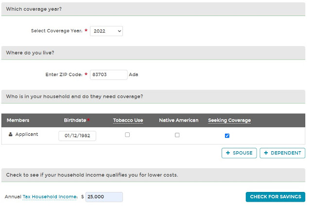
This was a hobbyhorse of mine when pandemic-triggered job losses were high. In the 38 states plus D.C. that have enacted the ACA Medicaid expansion, eligibility, which is year-round, is based on monthly income. In Medicaid expansion states, sudden income loss often triggers Medicaid eligibility, whereas income earned up to the point of loss may weaken or wipe out the marketplace subsidy. The state exchanges tended to a) bury information about Medicaid, b) ask for an annual (rather than monthly) income estimate, and c) not spell out, or bury, the Medicaid eligibility threshold. (Colorado's exchange provides the option of estimating income by year, month or week, but doesn't indicate why a monthly estimate might be important.)
Healthcare.gov is better than most on this front. The federal exchange asks at the outset if you want to check for Medicaid eligibility, and if you opt to, here is the display:

Best defense against the coverage gap: HealthSherpa
The coverage gap afflicts low-income prospective enrollees in the twelve states that have refused to enact the ACA Medicaid expansion (these include giants Florida and Texas). In those states, eligibility for marketplace subsidies begins at an income of 100% FPL, and most adults with income below that threshold are not eligible for Medicaid. About 2 million adults in those twelve states are in the coverage gap -- eligible for neither Medicaid nor marketplace subsidies.
Subsidy eligibility is based on an estimate of future income, however, and sheer ignorance of the gap, and the threshold for eligibility, doubtless throws a lot people into it. Annual income is particularly difficult to estimate for people in low income work; the marketplace application provides considerable flexibility; and there is no penalty for an overly optimistic estimate. Simple awareness of the threshold get can a lot of people over it. The default impulse when estimating income on government forms is to lowball it; that impulse needs an override for marketplace applicants near the 100% FPL threshold.
HealthSherpa provides that awareness. HealthCare.gov doesn't. There are no other "competitors" in this category, because all of the SBEs are in states that have expanded Medicaid.

Best lure to see what's on offer -- quickly: Covered California


Best CSR signposting: HealthCare.gov
Also important on the CSR front is simple signposting. Since CSR attaches only to silver plans, silver plans are all but invariably the best choice at incomes up to 200% FPL (CSR is available but fades to insignificance at incomes in the 200-250% FPL range). The American Rescue Plan boosted subsidies (through 2022) so that the benchmark (second cheapest) silver plan is free at incomes up to 150% FPL and costs 0-2% of income at 150-200% FPL. The exchanges' decision support tools do usually put silver plans at the top of the display for enrollees with incomes up to 200% FPL (see above) But all exchanges rightly offer the option of skipping the decision support -- in which case they generally show bronze plans first, ranking all plans by default in order of ascending (unsubsidized) premium.
Many of the exchanges don't do a very good job signposting CSR. HealthCare.gov does have clear messaging on this front:
When a CSR-eligible shopper clicks through, this notice is at the top of the plan menu:


------
* The most archaic exchange at present is New York's, which still does not integrate a subsidy estimate into quoted plan prices. New York's marketplace is truncated by the availability of a Basic Health Program, a highly affordable and successful Medicaid-like program, serving enrollees with income up to 200% FPL.
** Via a program called Enhanced Direct Enrollment, CMS allows commercial brokers and insurers to process applications, including subsidies, in HealthCare.gov states via a dedicated channel on HealthCare.gov. HealthSherpa is the dominant Enhanced Direct Enrollment platform, used by thousands of brokers as well as the general public. For sheer usability it's superior to the government-run exchanges, probably because it a) has a commercial motive to make enrollment as easy as possible, and b) because it's not hampered by governmental responsibility to explain every aspect of eligibility and application in exhaustive detail (though it explains some things better than others).
The shopping and application process on HealthSherpa is easier than on the exchanges in these ways:
- The site sucks you right in to a view of plans available at your income level. The home page almost compels you to enter a zip code, which takes you into a streamlined "shop and compare" tool that gets your essential info (income, age, household size) and displays available plans and prices (net of estimated subsidy) within 30 seconds.
- Easy edit: you can change any aspect of your input, e.g., income, and the estimates recalculate automatically. No going "back page," no re-entry of other info
- Easy filter: tick off a filter like "silver" on metal level, and the results change right away, without having to hit an "apply" button (which on other sites is usually at the opposite end of the page).
- No start-over: if you move from the plan preview to an application, the information you entered initially is ported in. So is your choice of plan, if you make one at the shopping stage.
No comments:
Post a Comment